Recreating the New York Times Covid-19 Spiral Graph in Python
Git Link
Covid Visualizations and Predictions
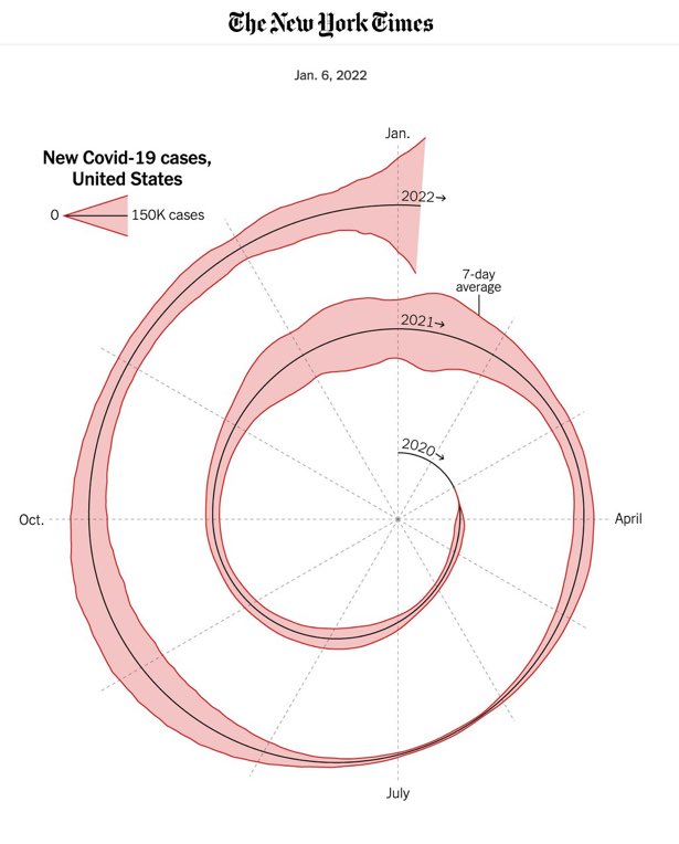
Recently New York Times published an article with Spiral Graph representing the spread of Confirmed COVID-19 cases in US. The piece in question is titled Here’s When We Expect Omicron to Peak. The opener image, which attracted a lot of attention on Twitter, shows the number of new COVID cases in the U.S. since the beginning of 2020.
Recreating the Graph with Python
Despite the negative comments for spiral graphs to represent the data, i wanted to recreate the Graph, not in R like others but in python using only Matplotlib. I also wanted the option to add mutiple countries in Spiral Graph for Comparison.
Load and Preprocess the raw Data
We use the COVID-19 Dataset by Our World in Data for the number of confirmed Coronavirus cases all around the worlds. We will also add the options to plot other parameters including Smoothed Covid Cases, Deceased Cases and Positivity Rates.
Downloading the Dataset
To Download the Dataset, we can use Wget python Library or manually download and place the file in working directory.
1
wget.download('https://covid.ourworldindata.org/data/owid-covid-data.csv', "data/Covid_Data.csv")
Preprocessing the Data
Since the original chart starts on January 1st, 2020, while the first cases for each country are presented on different dates, we add all the days from January 1st to the first date in the data. We also divided the Data for each country to different files based on ISO and placed in different files for ploting.
We also add the Extra Column of Days Passed since 2020-01-01 for Each Country. The day of the year will be our x-axis while the y-axis will denote the confirmed cases in country.
1
2
3
4
5
6
7
8
9
10
11
12
13
14
15
16
17
18
19
20
21
22
23
def preprocess_data(path: str,
                    country_codes: list,
                    start_date: str = "2020-01-01",
                    save_path: str = "data/",
                    cols_: list = ["total_cases", "new_cases", "new_cases_smoothed", "total_deaths", "new_deaths", "new_deaths_smoothed", "positive_rate"]):
    World_ = pd.read_csv(path)
    World_.fillna(0, inplace = True)
    World_['date'] = World_['date'].astype(str)

    for cc in country_codes:
        country_data = World_[World_["iso_code"] == cc]
        end_date = country_data.date.min()

        temp = pd.DataFrame(pd.date_range(start_date, end_date)[:-1], columns = ["date"])
        for col_ in cols_:
            temp[col_] = 0

        country_data = pd.concat([temp, country_data[temp.columns]], axis = 0)
        country_data['date'] = pd.to_datetime(country_data['date'])
        country_data['days_passed'] = (country_data['date'] - pd.to_datetime(start_date))/86400000000000
        country_data['days_passed'] = country_data['days_passed'].astype(int)

        country_data.to_csv(os.path.join(save_path,f"{cc}_Data.csv"), index = False, header = True)
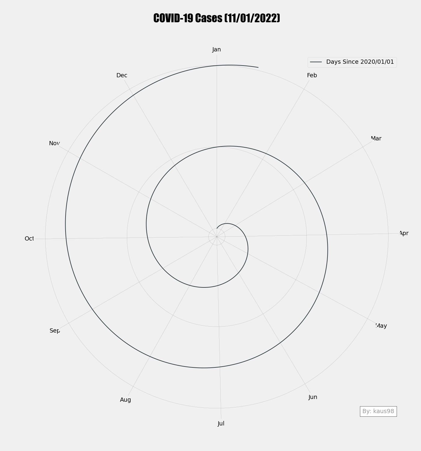
Building Simple Spiral Graph
We will start with building very simple Spiral graph in python which will act as base function for all the graphs. Some important features to note for this base class are:
- We will divide the spiral angles for each month based on number of days present in each month.
- We will add the Y Ticks for starting of each year.
- We will also add Watermark to add your name on bottom right.
- Offset is added to not start the graph from zero. With code you can Change the Ancor with your name
1
2
3
4
5
6
7
8
9
10
11
12
13
14
15
16
17
18
19
20
21
22
23
24
25
26
27
28
def get_graph_base(max_n: int,
                   line_color: str,
                   offset_radius: int = 100,
                   ancor_text: str = "By: kaus98"):
    months = pd.Series([31, 28.25, 31, 30, 31, 30, 31, 31, 30, 31, 30, 31]).cumsum() #Calendar to set angles for each month
    angles = pd.Series(np.linspace(0, 2*np.pi*(max_n/365) , max_n))
    radius = pd.Series(list(range(max_n))) + offset_radius

    fig = plt.figure(figsize=(14,15))
    ax = fig.add_subplot(111, polar=True)

    ax.set_theta_direction(-1) # Make Graph go Clockwise
    ax.set_theta_offset(np.pi/2.0) # Add Offset of 90 Deg
    ax.set_xticks(np.deg2rad(months/months.max()*360).values)
    ax.set_xticklabels([ 'Feb', 'Mar', 'Apr', 'May', 'Jun', 'Jul', 'Aug', 'Sep', 'Oct', 'Nov', 'Dec','Jan']) # Setting the Labels for X Ticks
    ax.set_yticks([0+offset_radius,365+offset_radius, 2*365+offset_radius]) # Adding the Y-Ticks for Each Year
    ax.set_yticklabels(["", "", ""])
    ax.grid(True, color = "#000000", linewidth = "0.1", linestyle = "solid" )

    # Making the Base Spiral Line
    ax.plot(angles, radius, "--", color = line_color, linewidth = "1.2", label = "Days Since 2020/01/01")
    ax.legend(loc = "upper right")
    ancor_text = AnchoredText(ancor_text, loc = "lower right", prop=dict(alpha=0.4)) # Adding the Watermark Text
    ax.add_artist(ancor_text)

    ax.set_title("COVID-19 Cases (11/01/2022)", y = 1.08, fontdict={"fontsize":26, "fontname": "impact"}) # Setting the Title
    return fig, ax, angles, radius
This will give us plain Spiral Graph without any covid Markers.
Now we have plain spiral graph, we can start adding the markers of covid new cases in any country. First we will add for US to check if we are getting similar graph as NY Times.
| |
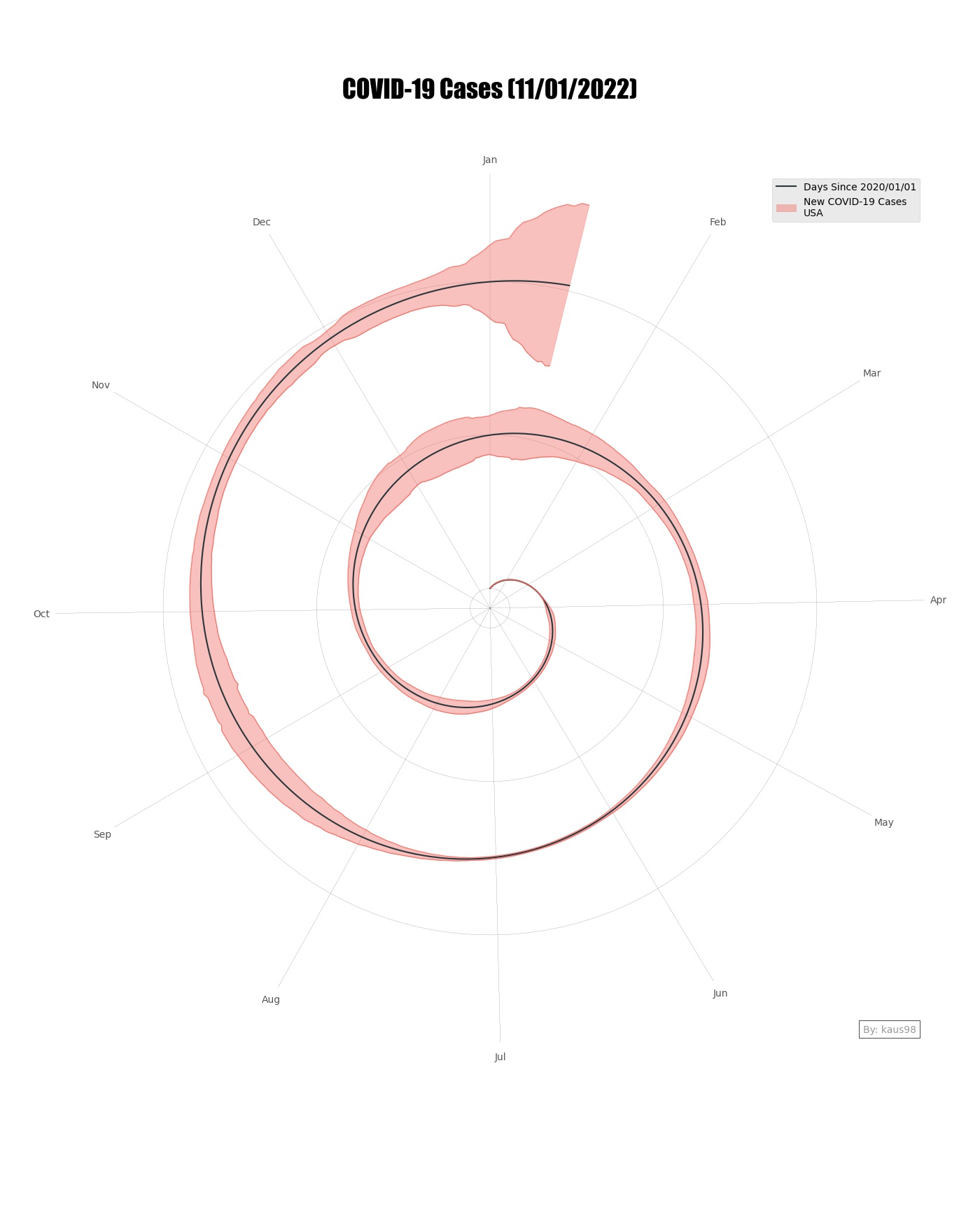 |
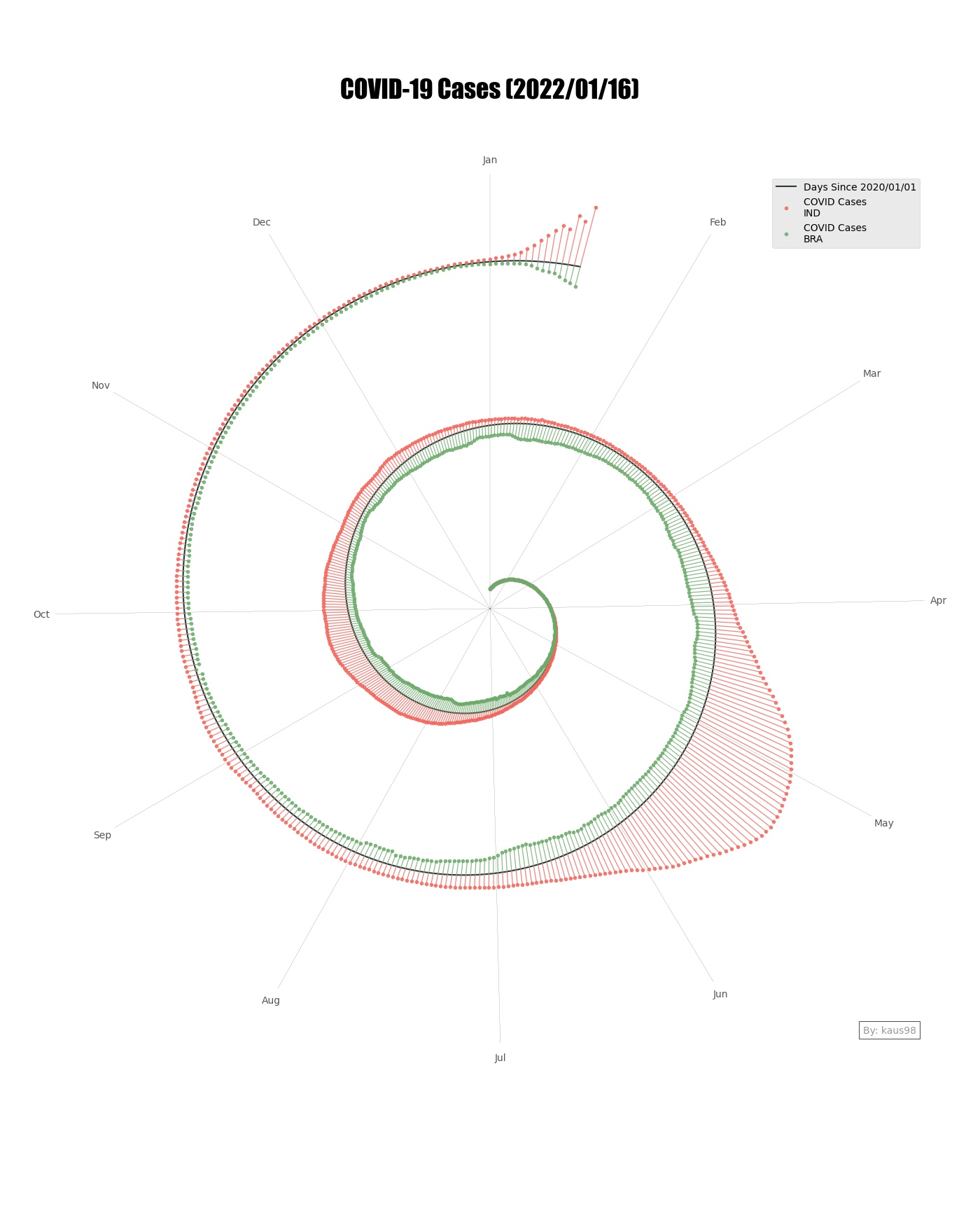
Now we will add other country which is India in our case and try to plot spiral graph.
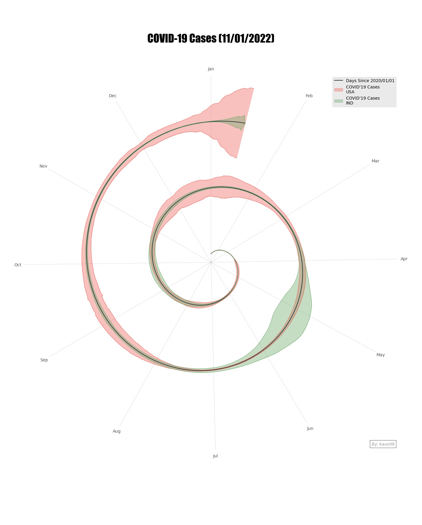 |
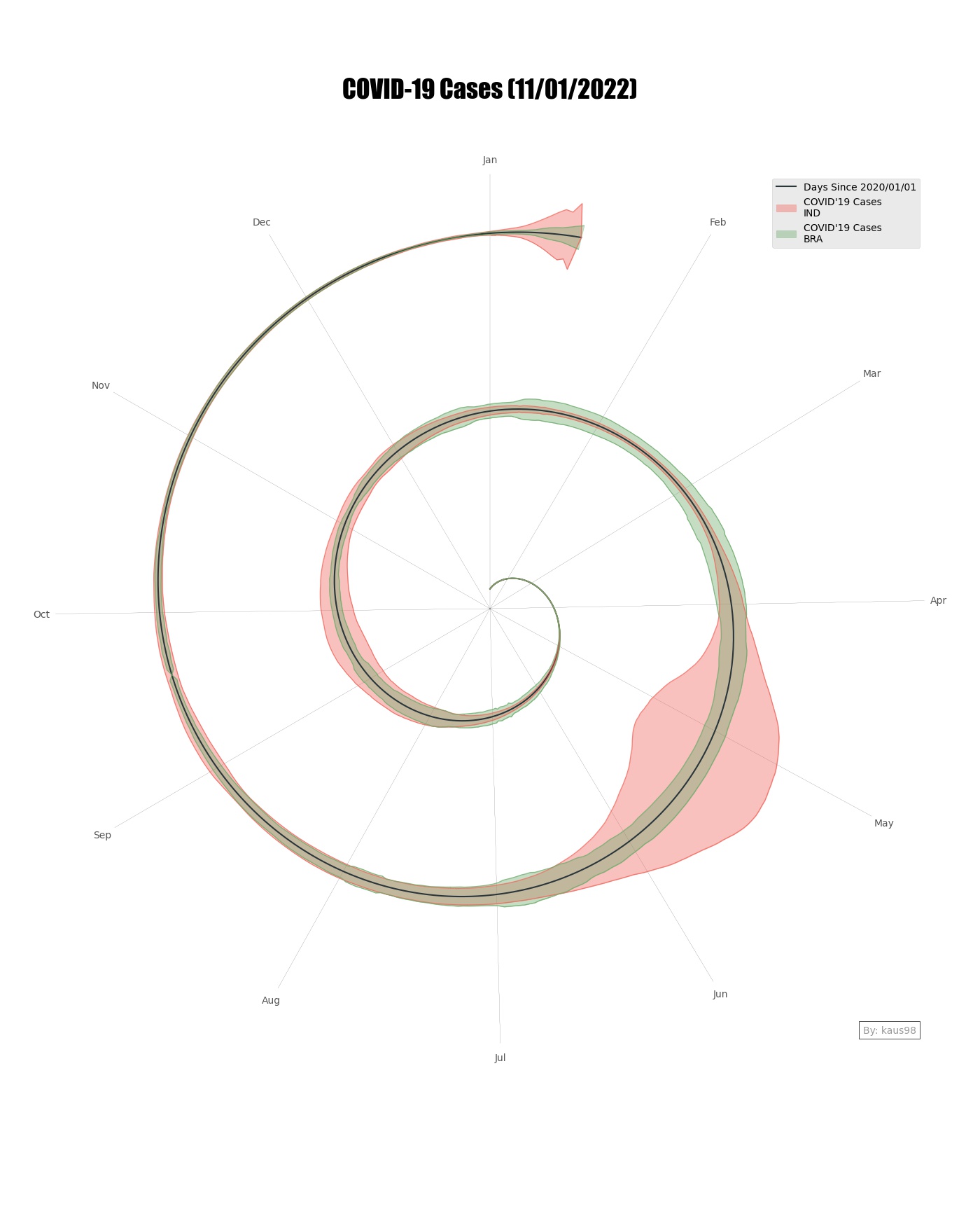 |
Great. It Works.
We can also create some other similar graphs that represent data in Sprial format but to much clear extend.
Spiral with Single Bar Graph
I have also added one other type of Graph inspired by souryashrestra which follows lines instead of Fill.
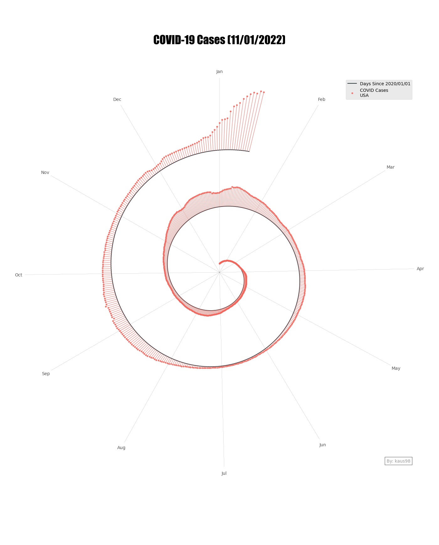 |
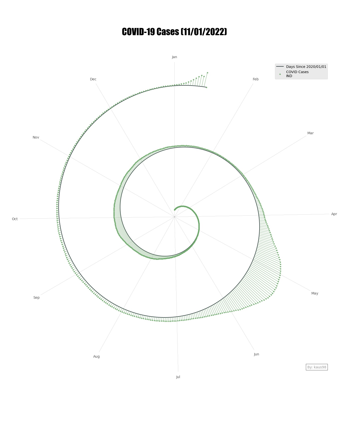 |
Spiral with Double Bar Graph
Much like the previous Graph we can create double sided bar graph which can show 2 different countries stats at each of side.
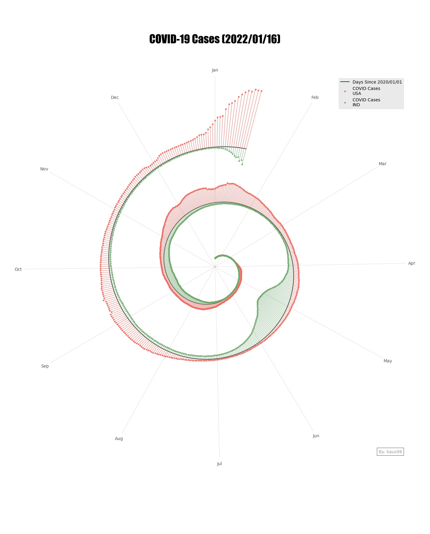 |
 |
Double Sided Graph with Confirmed and Deceased Cases
We can also represent 2 data on each side of Line representing New Confirmed and Deceased Cases for one Country.
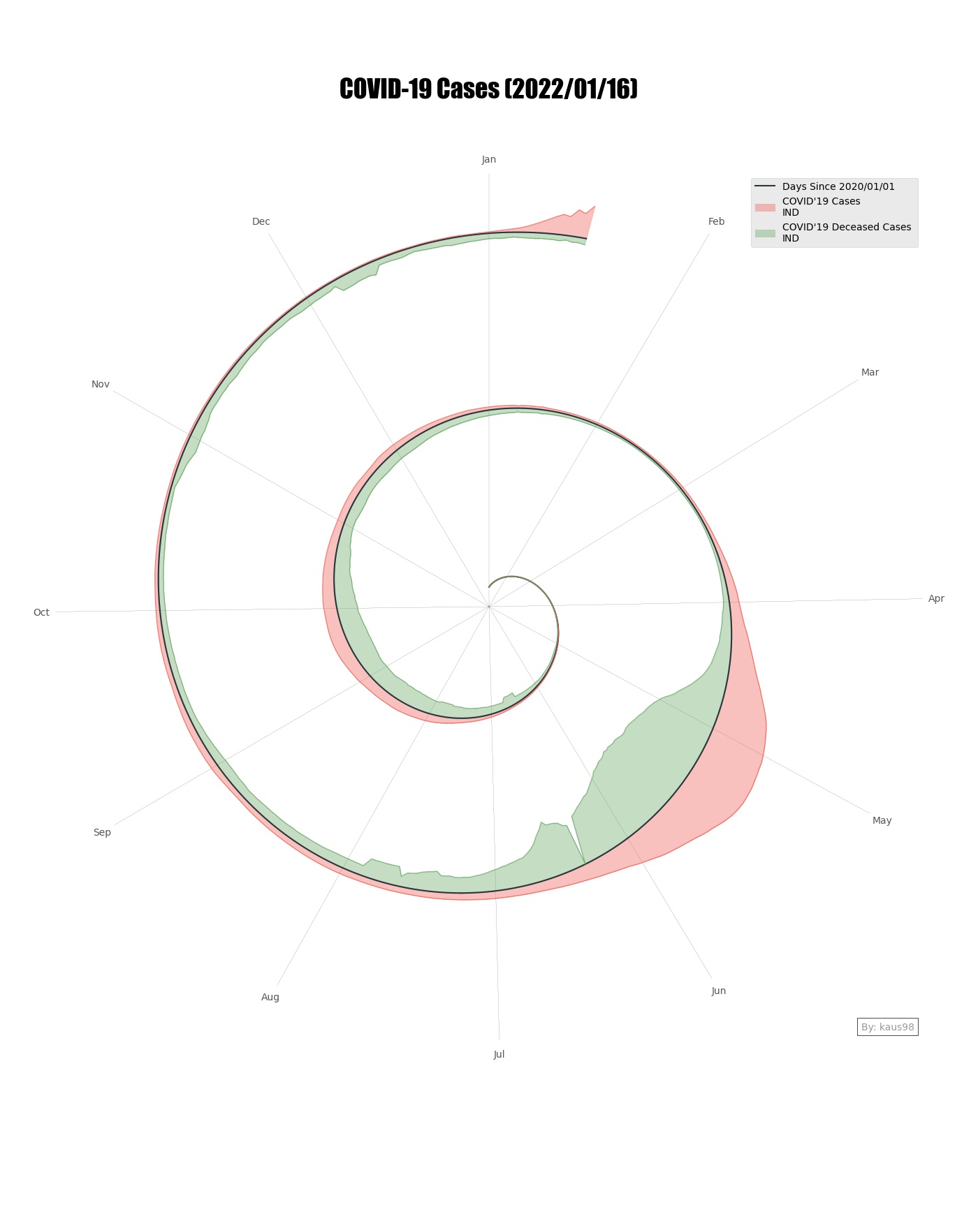 |
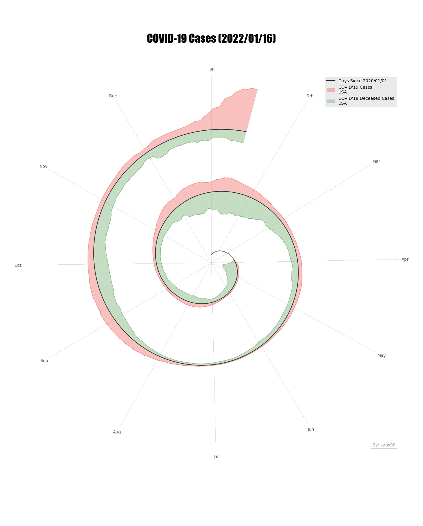 |
Create the video from Graphs
Since we have already create graph, we can create progression video with time. We can use ffmpeg defult command to make Video from Images.
1
ffmpeg -r 25 -pattern_type glob -i 'graphs/video_india/*.jpg' -vb 2M -vcodec mpeg4 -y movie_india.mp4
You can checkout sample Video from these Links.
Progression Video for India
Progression Video for USA
-
Previous
Elastic Quick Start Notes and Keywords Explained -
Next
Deploying Apache Spark, Jupyter Lab with support for Scala/Python